
Introduction
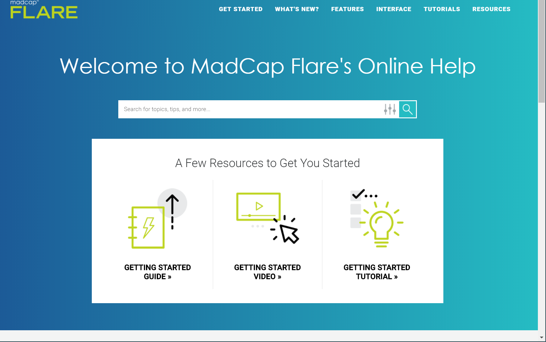
In early 2018, and without any prior fanfare or announcement, MadCap Software completely revamped the presentation and layout of the Help files for all their products. The old familiar MadCap colours of black and lime green were replaced with a predominantly turquoise colour scheme, and the Home page was stripped back and simplified.
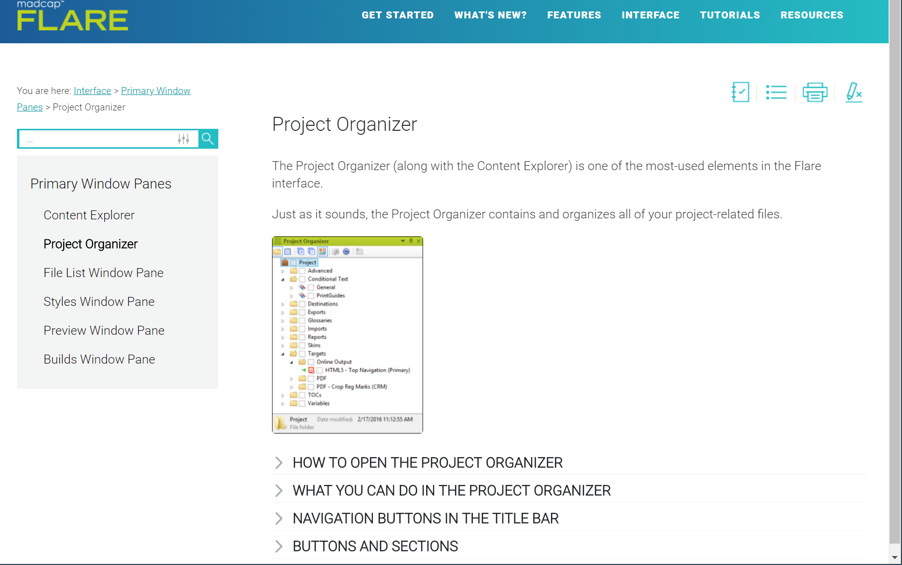
In all other topics, the navigation controls (including Breadcrumb, Search, and Menu of related topics) were moved into a non-scrolling area to the left-hand side of the topic content.
These changes interest me because MadCap has considerable experience and expertise in the field of user assistance, and a strong reputation to protect. I assume, therefore, that they must have good reasons for the changes they have made, presumably based on feedback from their users and research-based evidence of the way in which people use Help.
It is rather surprising that (at the time of writing) MadCap has not yet made available a downloadable project template containing the new colour scheme and topic layouts. So, if you want to move your Help design in the same direction, you’ll need to add and configure all the required files yourself. This article gives you a brief analysis of the key changes that MadCap have made, and some guidance on how you might emulate these changes in your own Help.
New Master Page
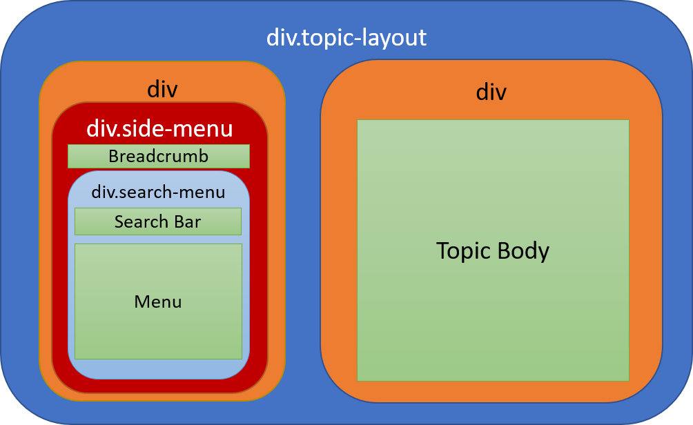
Although it is the stripped-down Home page that catches the eye when you first open Flare’s new Help, the change in layout of all the other topics is perhaps more significant. The key to the change in topic layout is a new Master Page that uses a Responsive Layout style called div. topic-layout to place a cell (technically a div) containing the navigation controls beside (and to the left of) a cell containing the topic content. An advantage of the Responsive Layout is that the layout is automatically changed on tablet and mobile screens, with the navigation cell being stacked above the topic content cell.
Within the left-hand cell, the navigation controls (Breadcrumb, Search, and Menu of related topics) are contained within a nested div (div. side-menu) that can be set, using a style, to have fixed position (preventing these important navigation items from scrolling out of view). Within this div, the Search and Menu are contained within a further div (div. search-menu) that can be hidden for tablet and mobile screens (again using a style). Here is a schematic representation of the divs within the Master Page, with the green boxes representing the Proxies that are contained within these divs.
Here is a simplified sample of code that you might use within your Master Page to achieve this structure:
			<div class="topic-layout">
				<div>
					<div class="side-menu">
						<MadCap:breadcrumbsProxy />
						<div class="search-menu"><
							<MadCap:searchBarProxy />
							<MadCap:menuProxy />
						</div>
					</div>
				</div>
				<div>
					<MadCap:bodyProxy />
				</div>
			</div>
Required styles
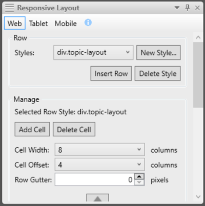
To achieve the side-by-side layout of the two main divs shown in orange in Figure 3, use Flare’s Responsive Layout Editor to create and configure a style called div.topic-layout based on the Row-8-4 template. Then set the first cell to have a Cell Width of 3 and a Cell Offset of 0, and set the second cell to have a Cell Width of 8 and a Cell Offset of 4.
In addition, you’ll need a style that prevents the navigation div from scrolling:
			div.side-menu
			{
				position: fixed;
			}
...and a style within the @media tablet section that causes the Search Bar and Related Topics Menu to be hidden on tablet and mobile screens:
			div.search-menu
			{
				display: none;
			}
The width of the breadcrumb needs to be fixed so that it wraps within the navigation div rather than overlapping the topic content. This style will do the trick:
			MadCap|breadcrumbsProxy
			{
				width: 300px;
			}
Skin
Since the Search Bar is displayed using a Proxy within the Master Page for the default (Web) medium, it is not required within the main TopNav skin. It can be hidden by using the HTML5 Skin Editor (Styles tab) to set the Display property of the Header to none. In theory, the Search Bar can be shown on tablet and smaller screens by changing the Display property to block. However, this didn’t work for me, and I needed to add the following style to the @media tablet section within my project’s stylesheet:
			.row.nav-search
			{
				display: block;
			}
The distinctive blue-turquoise horizontal gradient in the header is achieved, not by a setting in the Skin Editor, but by the following custom style within the project’s stylesheet:
			nav.title-bar
			{
				background: linear-gradient(to right, #1c5a97, #25bcc3);
			}
Other changes to the look and feel
MadCap has switched from a main font of Arial to Roboto, a freely downloadable font that was originally developed by Google for its mobile operating system, Android. You can download the Roboto font family from the Font Squirrel website and then add the required fonts to your own Flare projects. To use the fonts in your stylesheet, you’ll need to add @fontface commands of the following form:
			@font-face
			{
				font-family: 'Roboto';
				src: url(../Fonts/Roboto-Regular.ttf);
			}
Alternatively, Roboto is available as a web font from the Google Fonts website, but web fonts can cause pages to load slightly more slowly.
Finally, MadCap has chosen to customise the Search Bar by giving it a turquoise outline, square corners instead of the default curved ones, and custom images for the Filter and Submit buttons. To customise your own Search Bar, you’ll need to set up a Search Bar skin component (which controls the appearance of the Search Bar Proxy within the Master Page) and configure the Search Bar properties within the TopNav skin (which controls the appearance of the Search Bar in the topic header).
Summary
I haven’t covered all of the many presentational changes that MadCap has made to its Help by any means, but I consider the most important of these to be the re-positioning of the navigation controls in relation to the topic content. Key to this is an understanding of Flare’s Responsive Layout feature.
Further reading
- HTML Responsive Web Design (on w3schools.com)
- Responsive Layout in Flare 12
- Flare's Help on Responsive Content
- Master Page and Skin Components for TopNav
- Flare's Help on Master Pages
- Web fonts (on MDN web docs)
Training and Consulting in MadCap Flare
UA Europe provides specialist consulting and training (either face-to-face or via the Web) in MadCap Flare.