
Introduction
One of the most interesting challenges for web designers in recent years has been to create layouts that succeed on the wide range of device types use to browse the Internet. This has given rise to so-called responsive design, which typically uses a combination of the float property and CSS media queries to ensure that layouts adapt and reflow for a range of different screen sizes and orientations. This technology has been behind the scenes of the responsive HTML5 skins available in Flare since version 10. However, it has not been possible to use responsive design techniques within topic content without resorting to hand-coding of media queries or use of the Foundation Framework (described later in this article). Until, that is, the recent release of version 12 with its brand new "Responsive Layout" feature.
Applications of Responsive Layout
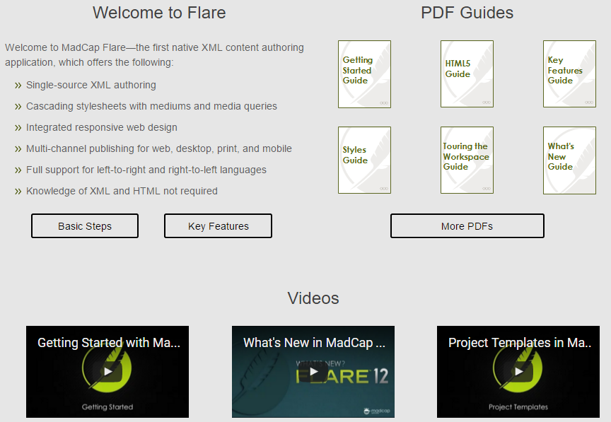
Although the new feature is an exciting innovation, don't be under the misapprehension that you'll be using it on a regular basis during your day-to-day authoring. Most content that we create as technical authors tends to be simple in layout, consisting of a single main flow of text, images, and tables. For such content, we don't need any special techniques other than perhaps setting a maximum width for images and tables so that they scale automatically on smaller screens. Where Responsive Layout could be useful, however, is on your Help system's home page or on other landing pages that present a set of options laid out as a grid. An example of such a layout is shown below.
How does Responsive Layout work?
In a nutshell, the Responsive Layout feature enables you to define, for a set of HTML blocks, a different grid layout for each of the three different standard screen sizes: Web (large), Tablet (medium), and Mobile (small). For example, you might want a set of six images, with an accompanying text hyperlink beneath each, to be displayed as two rows of three blocks on a large screen, three rows of two blocks on a tablet, and a single column of blocks stacked on top of each other on a mobile phone. The diagram below illustrates these three different layouts.
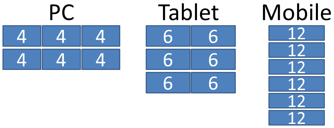
Responsive Layout enables you to achieve this by dividing the full width of the screen into 12 notional equal parts. You then express the width of each block within the grid in terms of these parts. For example, if you specify a width of 6, you are saying that the block should be resized to fill exactly half the width of the screen. Blocks are placed side-by-side from left to right when there is space available, but if the next block would cause the total width of the row to exceed 12 parts, then the block is placed beneath to start a new row. So specifying a width of 4 for each of six items would result in two rows of three items. The values for the widths are shown in the diagram above.
How do I create a responsive Layout?
Open the Responsive Layout window by clicking the new icon  on the Home ribbon. In the Responsive Layout window, a grid is called a "Row", and an individual HTML block within the grid is called a "Cell". You need to enter different numbers in the Cell Width fields for each of the three media types (Web, Tablet, and Mobile). Note that you are also able to enter a Cell Offset value for each cell, which results in the cell being indented from the left. For detailed instructions on how to create a responsive layout, refer to the Flare Help at bit.ly/1Wept6q.
Impact on the style sheet
If you have a strict policy of leaving the style sheet untouched in each of your Flare projects, then it is important to understand that as you create new responsive layouts by (for example) adding new row styles and changing cell widths, you are actually editing the style sheet that is associated with the topic. For this reason, you may want to make use of the new feature in Flare 12 that enables you to link specific topics to a different style sheet that is applied as an override to the project's Master style sheet. This would enable you to add the required CSS code for the responsive layout to this topic-level style sheet and to leave the project style sheet untouched.
Alternatives to Responsive Layout
If you are comfortable writing your own HTML and CSS code, it is possible to create responsive layouts without using the Responsive Layout window. You can use either of the following methods:
- Foundation Framework: This predefined CSS framework is included within your published Flare project. You can use it to apply special classes to your content that specifies how it should be laid out for the three basic screen sizes (large, medium, and small). Like Flare's Responsive Layout window, it is based on dividing the screen width into 12 equal segments. For more information, see foundation.zurb.com.
- CSS3 Flexbox: this is a layout mode built into CSS3 that enables you to achieve complex responsive layouts very simply using standard CSS properties. For more information, see bit.ly/1XiXcdv.
The advantages of using the Responsive Layout window are that you don't have to write any code, and that your layouts are shown correctly within Flare's XML Editor (which does not correctly render Foundation or Flexbox content).
Conclusion
The new Responsive Layout window in Flare 12 provides a way for authors to set up responsive grid-based layouts without needing to work directly with CSS code. It might be useful for specific types of topic such as the home page or other landing pages.
Training and Consulting in MadCap Flare
UA Europe provides specialist consulting and training (either face-to-face or via the Web) in MadCap Flare.